

Arrived
Design the portfolio experience for a real estate investment startup

My Role
Sole UX/UI designer
Timeline
Dec 2020 - February 2021
Tools
Sketch, InVision, Principle, Paper and pen.
Platform
Web and mobile
Introduction
Arrived is a real estate startup that allows users to invest in fractional shares of quality rental homes and earn income from rent and dividend. Working closely with Arrived’s CEO and a design manager, I designed the portfolio experience that allows users to efficiently track, explore and sell their investments.
Challenge
Business problem
As a new startup, Arrived is experiencing rapid success, and the portfolio section wasn’t built to scale.
User problem
Users want to have a clear understanding of their investment performance and transact shares they own.

Solution Preview
I designed an organized and comprehensive portfolio experience that allows users to efficiently track, explore and transact their investments.
My Process

1/ Research & Understand
Project kickoff
Align business goals and project scale with the client.
Through the kickoff meeting, I learned the current portfolio experience is a two-page section that wasn’t built to scale with Arrived’s rapid success.
In addition to pain points like hidden data and unclarified information, the current portfolio also lacks functions such as allowing users to sell shares they own or track each investment’s performance.
We decided to create a brand new portfolio experience that matches Arrived’s growth, with more comprehensive features to support user needs and a new brand style. In addition, since many users view Arrived’s platform through their phone, the portfolio experience should also be accessible through mobile.

Competitor analysis
Getting acquainted.
To familiarize myself with real estate investment knowledge, especially on the portfolio experience, I analyzed competitors’ portfolio performance and read user’s review online. This gave me basic ideas of the majority features, general preference and prepared me to ask the right questions in the user interviews.

User interview
Identify user needs towards an investment portfolio.
To dig deeper into user needs, I recruited five participants with investing experience for interview. I asked questions about their investing habits, what data they look at daily, and their investing goals, which gave me a clear sense of what data is most important for users.

Setting goals.
Combining business needs and user needs, after checking in with the client, I decided to focus on the following three goals when designing the portfolio experience:
1. Easy tracking - To help users have clarity scanning, comparing, and analyzing the overall account activities, as well as tracking the performance of each individual investment.
2. Better selling decision - To help users make accurate decisions selling shares they own at a price they determine.
3. Explore and educate – To acknowledge users about potential investment opportunities that benefit their portfolio and help grow a basic investing mindset.
2/ Define
Persona
The users.
Based on the research finding and this project’s timeline, the client and I decided to focus on the biggest user group in this project – the younger professional that wants to start journey of home ownership or real estate investing. I created the user persona, Jake, to help us align on the target user’s needs and characteristics throughout the design process.

Information Architecture
Define the portfolio structure.
The main point of the Information Architecture was to ensure the content of the portfolio section is structured to meet user needs of tracking, selling, and exploring their investments.

3/ Design
Quick sketches
Ideation
From former research, I learned a real estate investment portfolio is a data-heavy section that also relies on visual elements to represent the properties and create visual interests. Thus, during the ideation process, I aimed at designing simple combinations of data tables, texts, and images to improve clarity in scanning, comparing, and analyzing the portfolio information.
Low-fidelity wireframes
I used lo-fi wireframes as a communication tool to validate my assumptions and product strategy with the client and design manager.
I built the structure of concepts I narrowed down and reviewed with the client and design manager. We aligned on further design changes according to the business goal and user goals. Then I updated the design accordingly and moved forward to higher fidelity wireframes.
⬇️ The initial key screens (lo-fi)

⬇️ Iterations based on client and manager feedback


Brand guide
Professional yet approachable UI.
Based on the client goals and user goals, Arrived is looking for a brand style associated with professionalism where people entrust with their money, yet also is approachable and institutional to use.
The brand color, ultramarine blue, represents intelligence and responsibility, while the accent color, bright turquoise, brings growth, energy, and creativity.
To ensure clarity in scanning data-heavy tables, I combined bold, strong titles with white and light blue background for contrast and visual interests.

4/ Test and Iteration
Prototyping & Usability test
Testing with investors.
I developed an interactive prototype in InVision and tested it with investors. The design was well-received. Basing on the user feedback, I was able to verify my design decisions and conduct another round of iterations.


🎉 The success
100% success rate: All participants were able to find everything they were looking for to track their portfolio performance, sell shares and explore new investment opportunities.
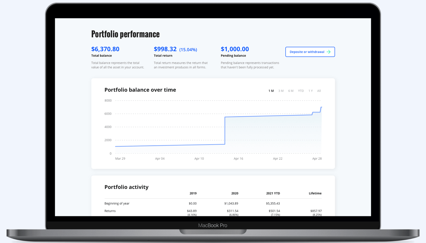
I was able to verify that users prefer the dashboard Overview over the non-dashboard design, because it increased the discoverability of other portfolio pages and added visual interests that make the content easier to read.
Most users think the UI is clean and easy to read. It fits their expectation of a professional, trustworthy, yet approachable investment product.
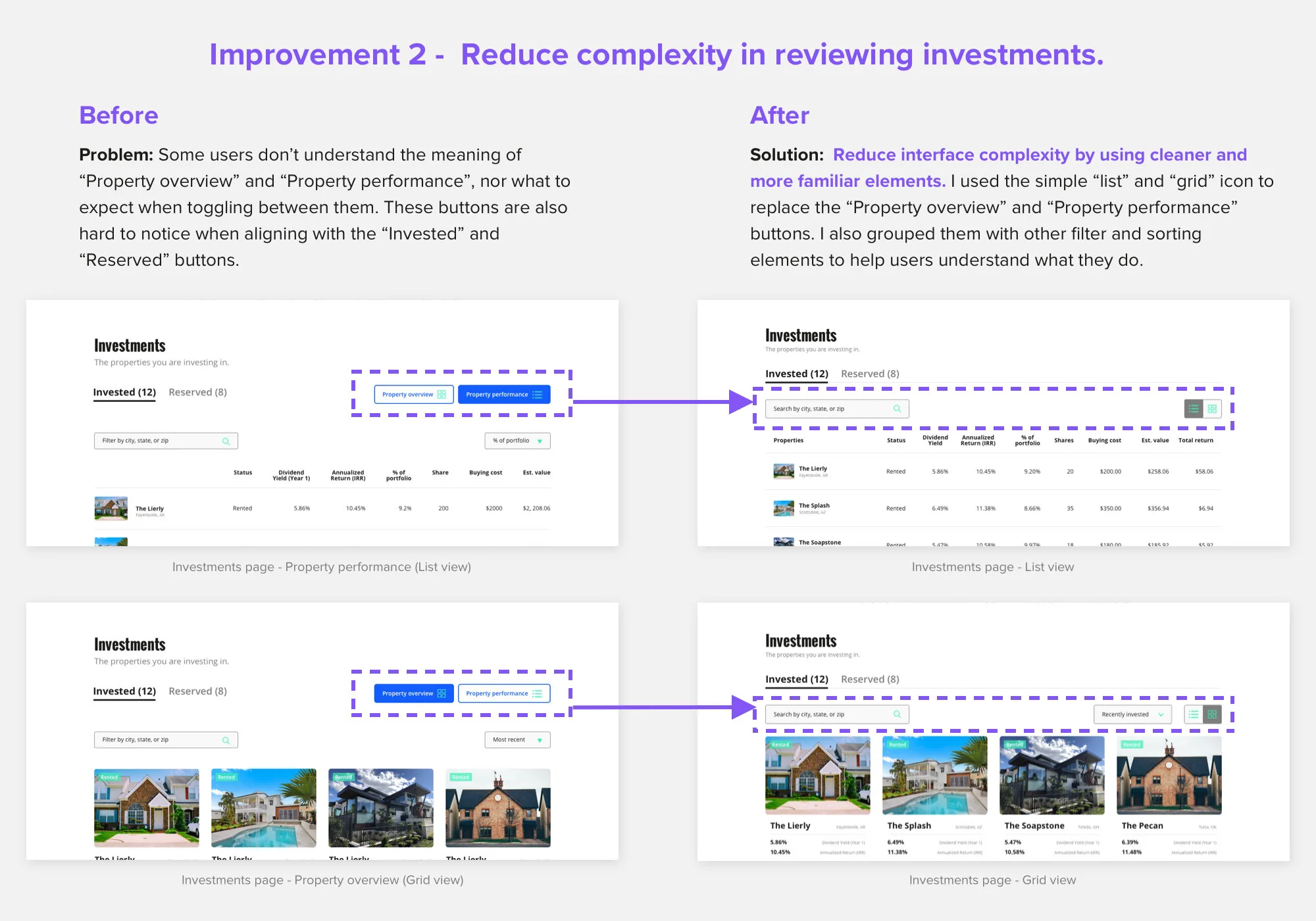
🚀 Second round of improvement based on user feedback


Final Design

Mobile experience
Scalable design
No matter the screen size, users needed simple and accurate data tables, texts, and images to clearly scan, compare, and analyze their portfolio information.

Accessible data tables
I especially spent time designing and testing the usability of the data tables on the phone. By applying intuitive horizontal scrolling and clearly labelling the data on each row, I ensured that users could track their investments by phone without losing the context.


The impact


🌟 I presented my final design to Arrived’s CEO, design managers, and peer designers. The design received lots of positive comments. In the end, I delivered my design documents to Arrived’s engineering team for execution.
“Very thorough research and design! Nice work.”
— Kenny Cason, Arrived CTO & Co-founder
🌟 My research findings and design process on the portfolio flow helped Arrived identify deeper and more detailed user needs, which impacted their roadmap.
“You took the portfolio experience above and beyond after you received early feedbacks of what users are confused about, which really opened our eyes on how much depth there could be on the portfolio side.”
— Ryan Frazier, Arrived CEO & Co-founder
🌟 Users enjoyed this comprehensive and organized portfolio design. The usability test results showed decreased error rate in finding individual investment performance and much less processing time in scanning performance overviews.
“This is definitely an upgrade from the original design. I can easily find everything I’m looking for to track my portfolio performance on this platform.”
— Yan Yang, User

Reflections
Learning 1 - Educate myself of fields I’m not familiar with within a short amount of time.
This project helped me learn how to fast absorb investment knowledge to solve problems of business and users. I found that analyzing competitors’ performance and chatting with investors about their investing habit effectively accelerated my learning speed. This is also an invaluable skill for future projects.
Learning 2 - Design for data-heavy content.
Through this project, I learned to balance complex data with simple and clean user experience. By employing user research and persona, I was able to show the most important information for user at the highest hierarchy. Obvious navigation, easily comprehended logical flow, and clear meanings of the presented data can transform a messy collection of information into an intuitive and comprehensible portfolio experience.
Learning 3 - Translate business goal into solutions that meet user needs.
I’m grateful to work with a client and a manager that care a lot about communication. We checked in frequently at each round of design and iteration to ensure the design directions align with the business goals, constraints, and user needs. Thus, we can make good impact on both users and business.

Next steps
With Arrived’s rapid growth, the portfolio section will enlarge in scale, too. I’m going to continue collaborating with Arrived’s team, listening to users’ feedback and keep polishing the portfolio experience in the future.
After discussing with the client, one of the next steps will be creating a way for users to respond to others’ offers when transacting shares. This can be a new feature in the sell shares section to help users make more informed selling decisions.
Thank you ❤️